Dark/light mode
The mode option in wrapper widgets config element (Element, React, Vue) and setMode in the Vanilla JS package control the widget’s theme. They define the initial appearance ("light" or "dark") and allow the theme to be changed dynamically at runtime.
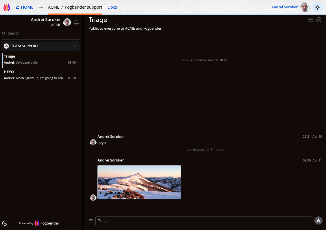
#Fogbender agent app in dark mode, with embedded support Roomy also in dark mode:

#Fogbender agent app in light mode, with embedded support Roomy in dark mode:
#Fogbender agent app in dark mode, with embedded support Roomy in light mode:

#Fogbender agent app in light mode, with embedded support Roomy also light mode:

Since the mode option can be set at runtime, you can keep the widget’s theme in sync with your application’s theme—updating it whenever the user switches between light and dark mode.